
Once upon a time there was a pure JavaScript model. The model sang songs about simplicity in a land full of complexity and confusion. The model's clear and beautiful voice comforted many hearts in the land.
var protagonist = {

    firstName: "Priscilla",
    lastName: "Flannery",

    todos: [
        { description: "Kiss frogs", done: false },
        { description: "Slay dragons", done: false }
    ],

    addTodo: function (description) {
        this.todos.push({
            description: description,
            done: false
        });
    }
};
One day framework dragons descended on the land, enslaving inhabitants and ravaging models. The model songs, once all keyed in F major, became never-ending vamps over B flat augmented arpeggios.
var protagonist = {

    firstName: ko.observable("Priscilla"),
    lastName: ko.observable("Flannery"),

    todos: ko.observableArray([
        { description: "Kiss frog", done: false },
        { description: "Slay dragons", done: false }
    ]),

    // ...
};
The models exchanged melody for infrastructure ...
var protagonist = Ember.Object.create({
    firstName: "Priscilla",
    lastName: "Flannery",

    // ...
});
... until one day the models stopped singing and fell silent.

It's getting harder to write a client-side domain model using plain old JavaScript these days. Frameworks have always been a part of JavaScript programming, mostly thanks to the hostile environment of the DOM, but the frameworks grow more intrusive all the time.
Plain old JavaScript is capable of expressing all the concepts and core ideas of an application. On the server-side we've learned to isolate and protect this sort of code using hexagonal style architectures, and what I fear about many of today's frameworks is just how deeply they need to intertwine themselves with my code. Everyone manipulates the DOM and communicates with the server, but there should also be some logic in the scripts folder that makes an app unique. Can anyone find it? Is it hidden by all the framework code?
Libraries like Knockout and Ember bury themselves into the deepest parts of an application's code. Even using extensibility points that can remove some infrastructure the frameworks change the public API of an object, they change how an object is tested, they change how an object is used, and they change how the object looks in the debugger. Most of all, they change your ability to move to some better, faster, newer, or updated framework in the future without touching and rewriting large sections of code. In exchange you'll get features like data binding, which isn't difficult to do (but is admittedly laborious). I'm not convinced this is a fair trade.
Does anybody else in here feel the way I do?
I tried to think of everything a web developer should know about HTTP, then recorded those things into a Pluralsight course: HTTP Fundamentals.
In the course you'll look at HTTP messages, message headers, cookies, caching, and authentication protocols. You'll see HTTP work from a low level TCP/IP perspective using Wireshark and System.Net.Sockets. But, you'll also see HTTP from a higher level architectural perspective and learn to think of the Web as an extension of your application's architecture.
Persistent connections, proxy servers, and content negotiation – it's all there. Give it a try.

It's happened to everyone. You thought you typed "Use Ruby To Capture Screen Shot" into a slide, but somehow you hit the i key instead of the o key and didn't notice. Now the slide is presenting itself proudly in front of an ultra-conservative Ruby programming crowd who is still amped up from drinking green tea all night.
What to do?
You can open a text editor, fix the HTML, and refresh the browser. The slide is fixed, but the slide show always starts from the first slide so you've lost your position in the deck. The crowd grows even more restless.
Let's see if we can prevent this sort of ugliness.
The first step is to assign every slide an ID when the slide show starts. We'll put this logic in a method named assignSlideIdentifiers and call it from the start method.
var assignSlideIdentifiers = function () {
    $("section").each(function (index) {
        $(this).data("id", index);
    });
};
The method numbers every slide from 0 to N and stores the associated number in each section element using jQuery.data.
Now that we have an ID for each slide, we can update the browser history whenever the presenter changes the current slide.
var updateHistory = function () {
    var id = $("section.current").data("id");
    window.history.pushState(
        { "id": id }, id, "#" + id
    );
};

var onKeyDown = function (event) {

    var handler = keys[event.keyCode];
    if (handler) {
        event.preventDefault();
        handler.action();
        updateHistory();
    }
};
The pushState method is part of the session history navigation API. The API has spotty support, but you can use Modernizr to test for the presence of the feature and there are shims to provide the API if the browser is not up to snuff.
The end result is the slide ID will appear in the URL fragment (a.k.a the hash) of the browser's address bar. For example, the address of the first slide will look like:
http://localhost/slides/http.htm#0
When you move to the second slide, the address will change to:
http://localhost/slides/http.htm#1
When you hit the browser refresh button, it is a simple matter for the script to look at the URL fragment and jump to the proper slide.
var setFirstVisibleSlide = function () {
    if (window.location.hash) {
        moveTo(window.location.hash.slice(1));
    }
    else {
        $("section").first().addClass("current");
        updateHistory();
    }
};

var moveTo = function (id) {
    $("section.current").removeClass("current");
    $("section").filter(function () {
        return $(this).data("id") == id;
    }).addClass("current");
};
With the slide ID in the URL, we can also use the moveTo method to support another new feature – the ability to jump to a new slide by modifying the URL.
var start = function () {
    assignSlideIdentifiers();
    setFirstVisibleSlide();

    $(window).bind("keydown", onKeyDown)
             .bind("hashchange", hashChange);

};

var hashChange = function () {
    moveTo(window.location.hash.slice(1));
};
The hashchange event has been around for a bit, and allows us to detect if the user types a new slide number into the URL, or follows a link to a different slide. We can also now edit slides on the fly, refresh the browser, and not lose position.
At this point we have a fairly useful slide presentation tool. Should we add animation features next? Or should we refactor some problems in the scripts?
Tune in next week to find out.
For all the code, see github.
Occasionally it's useful to print a slide deck onto paper, or export a slide deck to PDF using a print driver. Unfortunately, printing the slide show in it's current form will only display the single, current slide. We can fix this by adding a CSS media query at the bottom of the stylesheet.
@media print{

   @page {
       size: landscape;
   }

   section {
       opacity: 1;
       height: auto;
       overflow: auto;
       page-break-after: always;
   }

}
Media queries are logical expressions that return true or false and are well supported in modern browsers. When the expression returns true, the browser will apply the styles inside the expression to the current document. Inside the media query shown above, we'll turn on the display of all <section> elements while printing.
CSS media queries are powerful and becoming important these days. "Screen" and "print" are two media types you can use in a query to target styles for a specific output, but today you can also use media queries to target different screen resolutions, aspect ratios, color capabilities, and device orientations. As more and more mobile devices come online with powerful web browsers, media queries are an important tool in making HTML look good on different screen sizes.
When a web site goes to the trouble of recognizing and responding to a user's screen size and orientation it's called responsive design. For a great article on this topic, see Smashing Magazine's Responsive Web Design: What It Is and How To Use It.
And now ...
The slide presenter behaves well until we refresh the browser in the middle of a presentation. A refresh will restart the the slide show from the beginning. We'll fix this problem and add new features in the next post.
For all the code, see github.
What happens if someone using an old web browser wants to view our slides? We can add the following div outside of the section elements containing the slide content.
<div id="warning">
    Your browser may not support the
    features needed to display these slides.
</div>
Following a long standing tradition amongst software developers, we are not going to the trouble of specifying exactly what might be missing. Instead, we are only hinting at a potential catastrophe to create an aura of mystery and suspense.
We don't want the warning to display on the good browsers, though, so we'll turn the warning off by default using CSS.
#warning {
    display: none;
}
Now we can download a custom Modernizr build to detect the features required by our slides. Thanks to the CSS classes added by Modernizr, we can add additional style code to turn on the warning if a feature is missing.
.no-flexbox #warning,
.no-opacity #warning,
.no-csstransitions #warning {
    display: block;
    color: red;
    font-size: smaller;
    position: fixed;
    bottom: 0px;
}
In this case we've decided to warn the user if their browser doesn't support flexbox, opacity, or CSS transitions.
Next up – printing.
For all the code, see github.
I've worked with company A on a number of interesting commercial products over the years. After months of trying to find more good engineers in the local area, they recently decided to start working with an offshore consulting company.
We interviewed potential consultants for the project using screen sharing software and asked them to write code. The ones who passed started working on features for the next version of the product. They participate in daily stand up calls with the team here, and someone from here travels halfway around the world to work there every few months.
Result: Quality software delivered with every iteration.
Company B called me when they started having problems with an application built entirely offshore. I was told an executive visited the team once and he thought the demo was marvelous.
Result: There is a mythical beast in the ASP.NET world known as the "2,000 line Page_Load method". I never thought I'd see one first hand, but when I reviewed this code base I discovered an entire colony. The beasts live inside of houses built with #regions, and in the next village is an entire flock of monsters known as the "stored procedures using cursors inside triple nested loops". There isn't much land separating the beasts from the monsters, but there is a copy and paste river filled with fish we call "Execute method with switch and typecasts". The code is spectacular, and by spectacular I mean hair-raising.
If you go offshore to find talent, you might find success.
If you go offshore to find cost savings, you might find the iron triangle will tighten around your neck like a noose.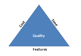
The current presenter will show one slide at a time, but the slides keep moving down the page since all the <section> elements are in the normal flow of the browser. The slides also appear and disappear instantly, and aren't centered in the window. We can change all of these qualities using cascading style sheets.
You've probably heard of cascading style sheets. Their unofficial working slogan is:
"CSS - Making The Easy Things Difficult Since 1996".
Ah, but no more.
Well, almost no more.
First we'll address the vertical positioning of each slide. Since only one slide appears at a time, we can set the height of all inactive slides to 0, and hide any content flowing outside the slide's box. Only the currently visible slide has a height.
section {
    opacity: 0;
    height: 0px;
    overflow: hidden;
}

section.current {
    opacity: 1;
    height: auto;
    overflow: auto;
}
It would also be nice if each slide did not appear instantly, but gradually faded into view. A fade in / fade out effect is easy with a CSS 3 transition.
section {
    opacity: 0;
    height: 0px;
    overflow: hidden;
    -webkit-transition: opacity 400ms linear 0s;
    -moz-transition: opacity 400ms linear 0s;
    -ms-transition: opacity 400ms linear 0s;
    transition: opacity 400ms linear 0s;
}
CSS 3 transitions are still a work in progress, but when IE10 arrives they will have support from all the major browsers. A transition automatically changes property values over time instead of instantly. First we give the name of the property to transition ("opacity" in this case, but we could use a value of "all" to transition as many properties as possible). Next is the duration (400ms), the easing function (linear), and the delay before starting (0s).
Since transitions are still a work in progress, they require a vendor prefix to work. Vendor prefixes are the –webbkit, –moz, –ms noise in the style. Instead of one "transition" line in the style definition above, we have 4. One day everything will work without vendor prefixes, and you'll have more time to spend with the iPhone 22.
You'll also use vendor prefixes if you want to give the slides a gradient background using CSS. Damien Galarza's CSS3 Gradient Generator will give you all the CSS you need with an interactive color designer.
Finally, some people might want to center their slide title. Centering just the title is easy.
section > h1 {
    text-align: center;
}
Still others might want to center the entire content of the slide. Centering block elements is always a bit weird, and one common approach is to give the element a specific width and use auto margins on the left and right sides. With CSS3 there is also the possibility of using Flexbox.
section.center {
  display: -webkit-box;
  -webkit-box-orient: vertical;
  -webkit-box-pack: center;
  -webkit-box-align: center;
}
Flexbox is another work in progress, and only the –webkit prefix is shown. Flexbox and Grid will make complex layouts easy, and 3 column layouts trivial. You can experiment with flexible box layouts on The Playground.
In the next post we'll add some feature detection for anyone who uses an older browser.
For all the code, see github.

 OdeToCode by K. Scott Allen
 Subscribe
 Twitter
 Search
 About
About
 Learn C#