
Every so often I like to wander into user experience design meetings and voice my opinion. I do this partly because I want to fight the specialization sickness that hobbles our industry. I believe anyone who builds software that comes anywhere close to the user interface should know something about UX design.
When it comes to UX, I follow T.S Eliot’s philosophy that good poets borrow, great poets steal. I’m not a good poet or a good UX designer, but I know what I like when I read poetry, and I know what works for me when I use software. I’ll borrow as many ideas as I can. In UX, there’s time for a hundred indecisions, and for a hundred visions and revisions, before the taking of a toast and tea.
I’ve been looking specifically at navigation for platforms that compose themselves from multiple applications. Applications might not be the right word to use, but think about platforms like Office 365, Salesforce, and Google’s GSuite. These are platforms where users move between different contexts. You are reading email, then you are working in a shared document, then you are reviewing a spreadsheet, then video chatting with a coworker.
All these platforms use the 9-dot app launcher icon to jump from one context to another. For example, here’s Office 365.
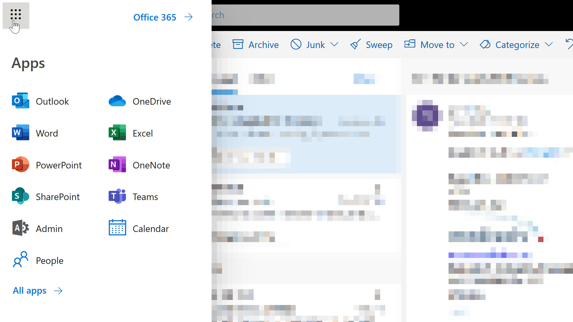
There’s a few guiding principles we might borrow from O365 at first glance.
However, look closely and you’ll see not every entry follows the guidelines. The outliers here are Calendar and People. Long time users of Outlook would know you can access your contacts and calendar without leaving Outlook, but on the web, Microsoft felt it was necessary to highlight these features of the platform from the highest-level navigation menu. The icons for People and Calendar stand out because the graphics are simple and schematic. The text for these entries stands out because the text is not a product name, but a friendly description of the feature you want to use.
Anyone who has ever created content for Microsoft will know how serious Microsoft can be when it comes to product names. I can imagine a war starting inside the company when someone proposed adding People and Calendar to the menu. On one side there are members of the Office team who have promoted the Outlook brand for decades. On the other side are people fighting for the discoverability and usability of the O365 platform.
Knowing Microsoft, the final decision relied on user experience testing, and I’m guessing the tests showed some non-trivial number of users couldn’t find their contacts or a calendar in the O365 UI.
I think software companies tend to overestimate the brand name recognition of their software, particularly when it comes to product suites and platforms with a variety of brands inside. All the pet names are confusing. Many users don’t care to dig into the details of 5 different product offerings. I assert this fact based on anecdotal evidence, like the following thread about the game show Who Wants to be a Millionaire?

That’s Microsoft. What can we borrow from Google?
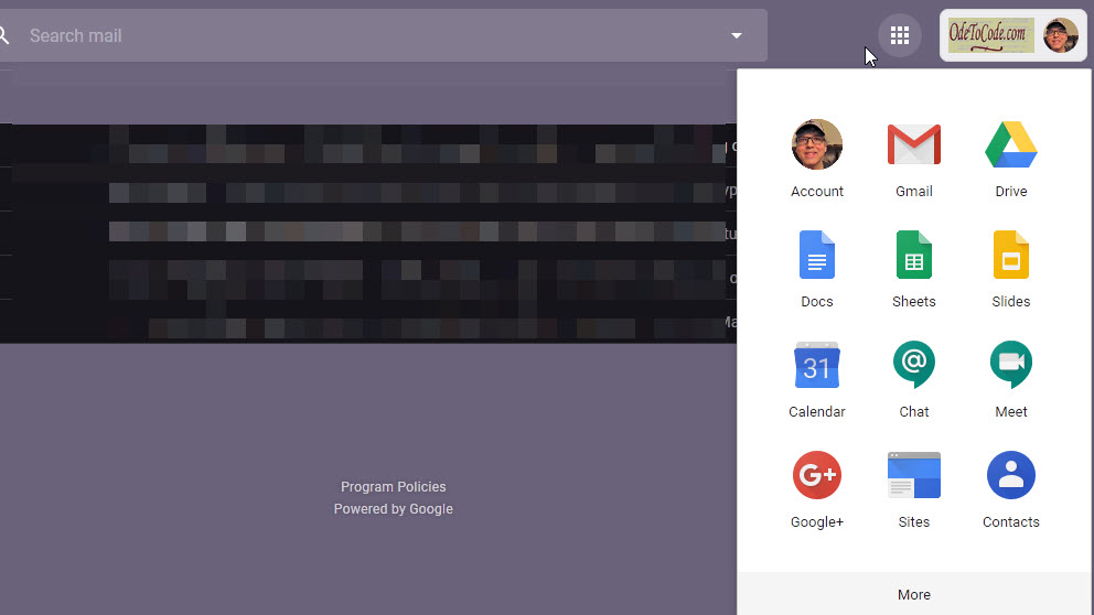
Again, we have the app launcher icon, and a navigation menu with icons and text. The icons are representative, simple, and contain only a touch of shading and nuance. The few brand names that jump out are Gmail, Drive, and the notorious Google+. Most of the entries consist of simple text and icon pairs that work in concert to provide clues about a feature area. For example, the @ icon for Chat suggests a text chat. The camera icon for Meeting suggests a video conference.
What about LinkedIn?
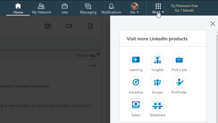
Once again, we see an app launcher opening a collection of icon and text pairs. However, there’s something ... uninspiring about the LinkedIn UI. The monochrome look gives a washed out appearance. There are no distinctive colors to scan for when trying to locate a familiar feature. Each entry is smaller than the entries in O365 and G Suite, and the menu appears unbalanced with the amount of white space it uses. And what are those icons? Groups and Insights are too similar, and the salary icon (an eight-sided nut laying on two sheets of paper?) is too abstract and appears out of focus - an impressive effect for a 40-pixel icon built with SVG.
My criticism of the icons isn’t based solely on some inner sense of aesthetics. There is research from the Nielson Norman Group on icon usability which says icons should be simple, memorable and recognizable. There’s also the basic design heuristics that we should have users rely on recognition, not recall, and that a system should use words and phrases familiar to the user rather than system oriented terms (like abstract product names).
In the end you can borrow ideas from multiple platforms and usability studies to guide the design of an app launcher that works best for your system. Just remember that schematic, recognizable icons and user-friendly text make the most effective launcher.

 OdeToCode by K. Scott Allen
 Subscribe
 Twitter
 Search
 About
About
 Learn C#