
Step 1 gave us raw material to mold. Step 2 molded material into a readable diagram. The final step, step 3, is going to add some aesthetic touches. What? I thought this was a pragmatic process! Yes, that’s true. But we can always take 2 minutes to add finishing touches. We want to make the diagram easier to read, and we can use some additional formatting to draw attention to significant concepts in the drawing.
Here are three possible responses a developer might give when looking at our diagram:
A: Ahhhhh, I understand, now.
B: This is the most beautifully detailed diagram I’ve ever seen.
C: Who let their 3 year run amok with the plotter?
Our goal is to elicit response A.
The first thing I’ll do is generally add some thickness to the connector and shape lines. The spindly, thin lines that come by default are difficult to see and look weak. Choose varying line thickness to accent portions of the diagram. A line with a 9-point weight is a solid boundary - the kind of boundary you might want around a secure process. Right-click a shape and select Format –> Line to set the line properties. CTRL-click multiple shapes to set their properties all at once. This is also a good time to make the arrowheads on directional connectors stand out by adding thickness.
Finally, add a splash by filling your geometrical shapes with some color. Nothing too fancy, but white filled boxes on white paper don't stand out and can be hard to read. Right-click shapes, then select Format –> Fill. This is also a good time to add a title.
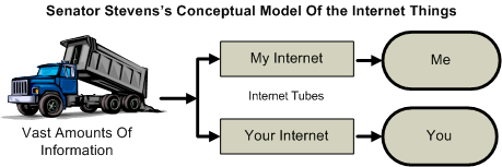
Voila! In less than 10 minutes we’ve created a diagram worth at least a few hundred words. We can hang it on walls, and include it in the architecture documentation. In this case, what we’ve built is actually more political commentary than software documentation, but the process worked just as well.

 OdeToCode by K. Scott Allen
 Subscribe
 Twitter
 Search
 About
About
 Learn C#