
Assuming I already have an existing web site or web application deployed, running, and working great for desktop browsers, my decision tree for getting the site working on mobile devices looks something like the following. 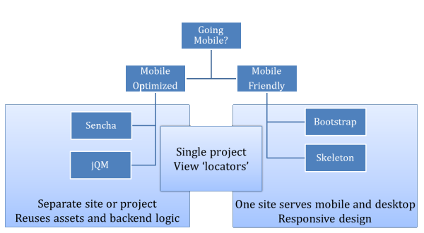
The right-hand side, the "mobile friendly" approach, is primarily concerned with adding responsive design touches to an existing site. Frameworks like Bootstrap and Skeleton can make this easier, if they can be worked into the existing design. The right-hand side seems to work best with content heavy web sites (news, blogs, articles, and dashboards) with little interactivity from the user.
The left-hand side uses frameworks like jQuery Mobile to create the illusion of a native app. These frameworks generally require some major structural changes to the presentation layer and thus often work better as a separate site and source control project (m.server.com for mobile devices, server.com for the desktop, for example). A clean separation allows for a complete focus on the mobile experience, but there is still the possibility of reusing assets, media, and backend services previously built for the desktop version.
The middle box is a hybrid approach using a framework like ASP.NET MVC that allows for view selection at runtime (Index.cshtml and Index.mobile.cshtml). Although this approach makes it easy to reuse quite a bit of code (even into the UI layer of the server), and often takes less time, it sometimes sacrifices the optimizations that can be made when working from a clean slate and doesn't evolve as easily when adding new features. This approach might use just a CSS framework, or might use a framework like jQuery Mobile, while still keeping the ability to make structural changes like an entirely new site.
Like everything else in software, the decisions are all about tradeoffs and where the software has to go in the future.

 OdeToCode by K. Scott Allen
 Subscribe
 Twitter
 Search
 About
About
 Learn C#